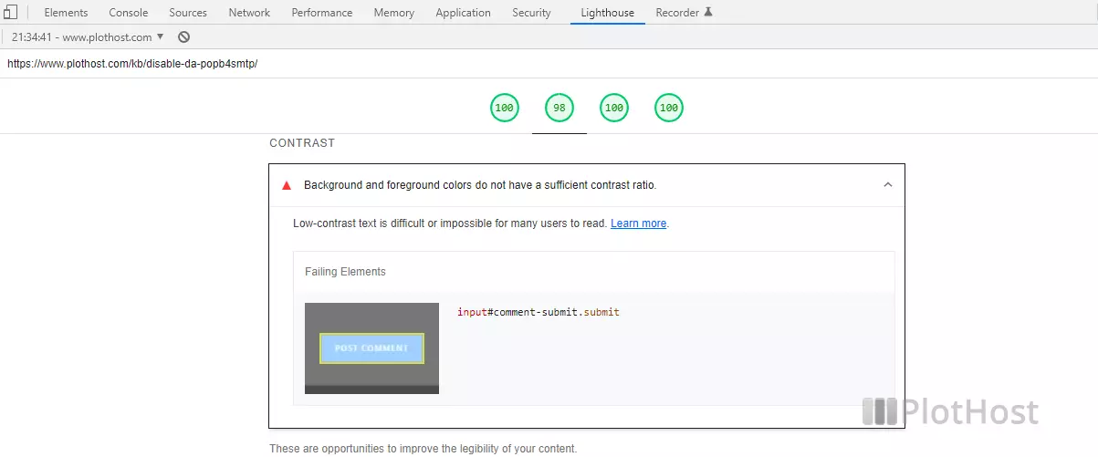
When running a Lighthouse test on your computer or online at https://pagespeed.web.dev/, you might get a message regarding the contrast of the text elements from your page:

CONTRAST
Lighthouse Report
Background and foreground colors do not have a sufficient contrast ratio.
Low-contrast text is difficult or impossible for many users to read. Learn more.
As per Google’s description, Lighthouse uses Success Criterion 1.4.3 Contrast (Minimum) from Web Content Accessibility Guidelines (WCAG) 2.1. The contrast of normal text should be at least 4.5:1:
Success Criterion 1.4.3 Contrast (Minimum)
The visual presentation of text and images of text has a contrast ratio of at least 4.5:1, except for the following:Large Text
Large-scale text and images of large-scale text have a contrast ratio of at least 3:1;Incidental
Text or images of text that are part of an inactive user interface component, that are pure decoration, that are not visible to anyone, or that are part of a picture that contains significant other visual content, have no contrast requirement.Logotypes
(WCAG) 2.1
Text that is part of a logo or brand name has no contrast requirement.
To fix these issues, you must adjust the contrast ratio of the background and foreground colors. One software that you can use is Colour Contrast Analyser (CCA). It’s available for free for Windows and macOS here https://www.tpgi.com/color-contrast-checker/ The description from the website:
TPGi’s free color contrast checker tool that allows you to easily determine the contrast ratio of two colors simply using an eyedrop tool. The CCA enables you to optimize your content–including text and visual elements–for individuals with vision disabilities like color-blindness and low-vision impairments.
CAA website
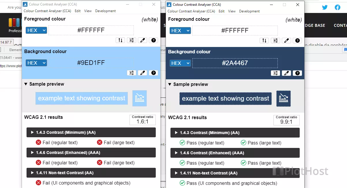
Just launch the program and select the actual background and foreground colors for the specific element reported by Lighthouse. Then modify the background and/or the foreground color until you get a green mark at least on section >1.4.3 Contrast (Minimum) (AA).
In our example, we increased the contrast ratio for a button from 1.6:1 to 9.9:1.

After you have determined the new colors, modify them in the HTML/CSS code of your site. Run the Lighthouse Report again.
